
Introduction
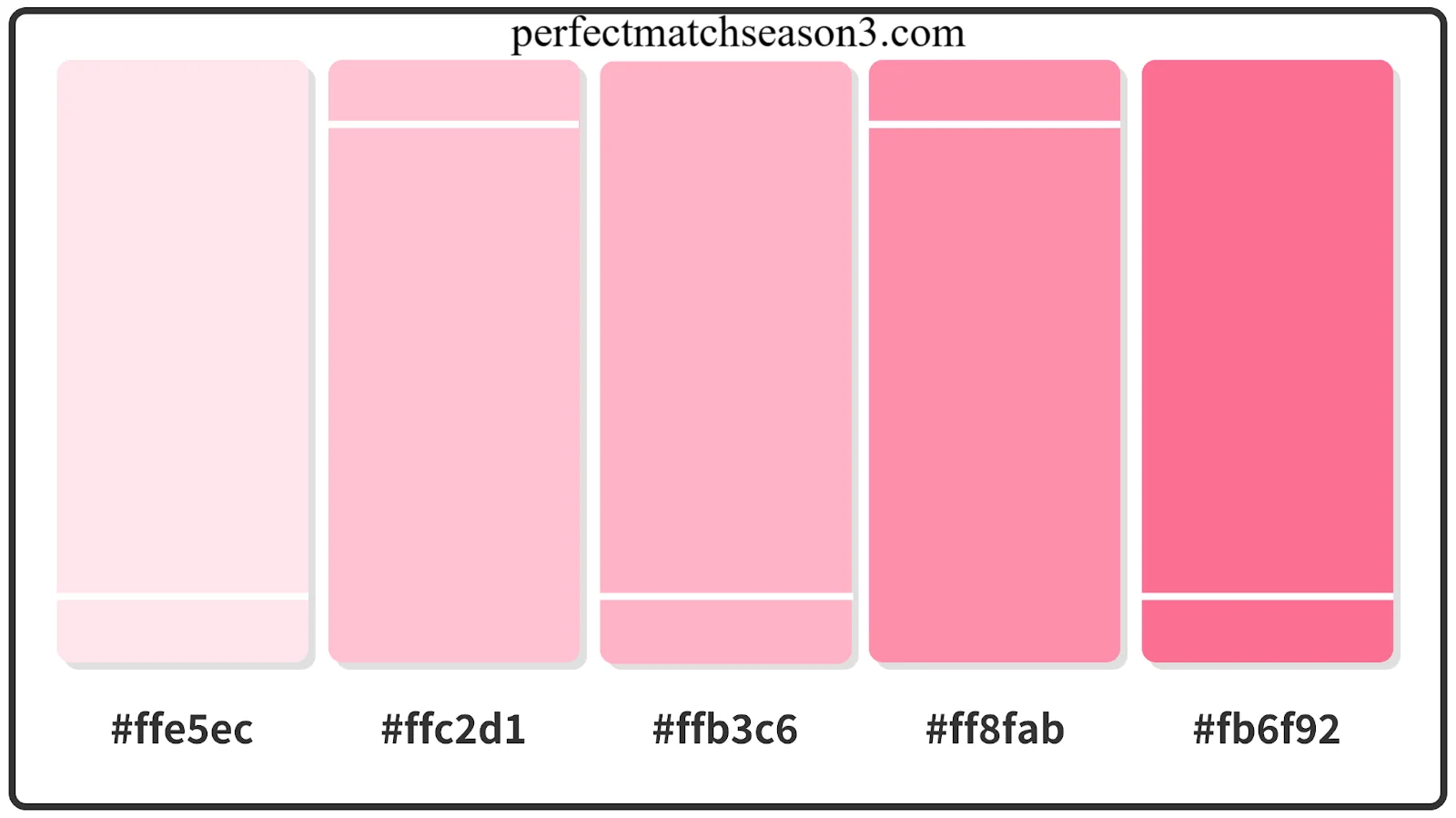
If you have ever scrolled through Instagram and stopped on a feed that looks soft, calm, and dreamy, you were probably looking at pastel colors. Finding the right pastel color codes for Canva can completely change how your designs feel to your audience. Soft pink, baby blue, mint green, these shades feel gentle and welcoming, and that is exactly why so many brands and creators use them today.
In this article I will walk you through everything you need to know about pastel color codes for Canva. You will get a full list of ready to copy HEX codes, learn how to add them inside Canva, and discover which combinations work best for branding, social media, and websites. By the end, you will have a complete pastel toolkit you can use right away.
What Are Pastel Colors and Why Are They So Popular
Pastel colors are light, soft tones created by mixing a base color with a large amount of white. This gives them lower saturation and higher brightness compared to bold, vibrant colors.
People love pastel shades because they feel calm, friendly, and approachable. They work beautifully for lifestyle brands, wellness pages, wedding invites, baby products, and modern minimal logos. Pastel color codes for Canva have become especially popular because Canva makes it so easy for anyone, even without design experience, to apply these soft tones with a simple HEX code entry.
Another reason pastel shades trend so much is psychology. Soft colors reduce visual stress and make content easier to look at for longer periods. That is why many productivity apps, journaling templates, and social media aesthetics lean heavily on pastel palettes.
Popular Pastel HEX Codes for Canva (Ready to Copy)
Below is a categorized list of the most used pastel color codes for Canva. Simply copy the HEX value and paste it into Canva’s color picker.
Pastel Pink Shades
- Blush Pink:
#F7CAC9 - Soft Rose:
#FADADD - Baby Pink:
#F9C6C9 - Cotton Candy Pink:
#FFD1DC
Pink pastels bring warmth, softness, and femininity. They work well for beauty brands, greeting cards, and lifestyle content.
Pastel Blue Shades
- Baby Blue:
#A7C7E7 - Powder Blue:
#B6D0E2 - Sky Mist:
#CDE7F0 - Soft Denim:
#A2C4DE
Blue pastels create a calm and trustworthy feeling. They are perfect for wellness apps, healthcare content, and corporate presentations that want a friendly tone.
Pastel Green Shades
- Mint Green:
#B7E4C7 - Sage Green:
#C4D7B2 - Soft Sea Green:
#B2E0D4 - Pistachio:
#C0DFA1
Green pastels represent freshness, nature, and balance. Perfect for eco friendly brands, organic products, and self care pages.
Pastel Yellow Shades
- Butter Yellow:
#FFF3B0 - Soft Lemon:
#FDFD96 - Cream Yellow:
#FAF3B0 - Vanilla Custard:
#FFF5CC
Yellow pastels bring cheerfulness and positivity. They work great for children’s brands, food pages, and playful social posts.
Pastel Purple Shades
- Lilac:
#D8BFD8 - Lavender Mist:
#E6E6FA - Soft Orchid:
#D9C6E0 - Wisteria:
#C9A0DC
Purple pastels feel creative and calming at the same time. Great for beauty, spiritual, and artistic brand pages.
Pastel Peach Shades
- Soft Peach:
#FFDAB9 - Apricot Cream:
#FFE5B4 - Coral Blush:
#FFDFC4 - Melon Milk:
#FFE0C7
Peach pastels feel warm and inviting. They suit fashion, food, and personal branding projects.
Pastel Beige Shades
- Warm Sand:
#EDE0D4 - Soft Ivory:
#F5F0E6 - Cream Beige:
#F0E6DA - Almond Milk:
#F2E8DC
Beige pastels are neutral, elegant, and easy to combine with almost every other pastel shade.
How to Add HEX Color Codes in Canva
Adding pastel color codes for Canva is simple, even for beginners. Follow these steps.
- Open your Canva design and select the element you want to color, such as text, shape, or background.
- Click on the color circle icon in the toolbar.
- In the color panel, click the plus icon or the HEX input box at the bottom.
- Type or paste your chosen pastel HEX code.
- Press enter and the color will apply instantly.
You can also save your favorite pastel shades to your brand kit so you do not need to retype them every time. This is especially useful if you are working on multiple projects with the same pastel palette.
Best Pastel Color Combinations for Branding and Social Media
Choosing the right pastel color codes for Canva is not only about picking pretty shades. It is about creating a combination that feels balanced and consistent.
For Instagram feeds: Blush Pink (#F7CAC9) with Cream Beige (#F0E6DA) and a touch of Mint Green (#B7E4C7) creates a soft, cohesive scroll stopping aesthetic.
For presentations: Baby Blue (#A7C7E7) paired with Soft Ivory (#F5F0E6) and a deep navy text color keeps slides professional yet friendly.
For websites: Lavender Mist (#E6E6FA) combined with Warm Sand (#EDE0D4) gives a modern, calm feel that keeps visitors comfortable while browsing.
For logos: A duo of Sage Green (#C4D7B2) and Butter Yellow (#FFF3B0) feels fresh, trustworthy, and memorable without being too loud.
A good rule I personally follow is picking one dominant pastel, one supporting pastel, and one neutral tone like beige or white. This keeps designs balanced instead of overwhelming.
Color Psychology Behind Each Pastel Shade
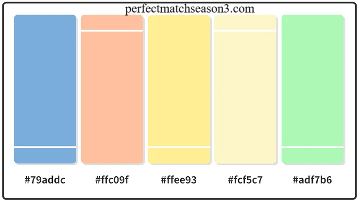
- Pink suggests kindness, romance, and softness.
- Blue suggests trust, calm, and reliability.
- Green suggests growth, health, and balance.
- Yellow suggests happiness and energy in a gentle way.
- Purple suggests creativity and imagination.
- Peach suggests warmth and friendliness.
- Beige suggests neutrality, comfort, and elegance.
Understanding this psychology helps you choose pastel color codes for Canva that match your brand message, not just your visual taste.
Font and Background Pairing Tips
Pastel backgrounds need careful font choices for readability. Dark charcoal, deep navy, or muted brown text usually reads best on pastel backgrounds. Avoid white or very light gray text on pastel shades since the contrast becomes too weak.
For headings, a bold serif or rounded sans serif font adds character without clashing with soft colors. Keep body text in a simple, clean sans serif for easy reading.
Accessibility Tips for Contrast and Readability
Pastel shades look beautiful, but they can hurt readability if not paired correctly. Keep these tips in mind.
- Always check contrast ratio between text and background using Canva’s built in contrast checker.
- Avoid pairing two light pastels together for text and background.
- Use darker accent colors for buttons and call to action elements so they stand out.
- Test your design on both mobile and desktop screens before publishing.
Following these simple accessibility rules ensures your pastel color codes for Canva look great and remain easy to read for every visitor.
Frequently Asked Questions
What are the best pastel color codes for Canva? Some of the best options include Baby Blue #A7C7E7, Blush Pink #F7CAC9, Mint Green #B7E4C7, and Butter Yellow #FFF3B0. These shades work well across social media, branding, and web design projects.
How do I use HEX codes in Canva? Click on any element, open the color picker, click the HEX box, and paste your chosen code. Canva will instantly apply the exact pastel shade you want.
Which pastel colors work well together? Pink and beige, blue and ivory, and green and yellow are classic pastel combinations that feel balanced and visually pleasing.
Are pastel colors good for branding? Yes. Pastel colors help brands appear friendly, modern, and approachable, which is why many wellness, beauty, and lifestyle brands use them.
What is the most popular pastel palette? The pink, blue, and cream combination remains one of the most requested pastel palettes for feeds, websites, and product packaging.
Can I save pastel colors in Canva for future use? Yes, you can add any pastel HEX code to your brand kit so it is available across all your future designs.
Do pastel colors work for professional presentations? Yes, especially soft blue and beige tones, which keep the design calm and professional without feeling cold.
Conclusion
Pastel shades bring softness, warmth, and calm energy to any design, and now you have a complete set of pastel color codes for Canva ready to use. From pink and blue to green, yellow, purple, peach, and beige, you can mix and match these tones to fit your brand personality perfectly.
Try picking one palette from this guide and apply it to your next Canva project today. Which pastel combination are you most excited to try? Save this guide so you always have your favorite pastel color codes for Canva within reach.
perfectmatchseason3.com
Email: johanharwen314@gmail.com
Author Name: Hamid Ali
About the Author: Hamid Ali is a content writer who focuses on design, branding, and digital creativity topics. He enjoys breaking down practical design tools like Canva into simple, easy to follow guides that help creators and small business owners build beautiful, on brand visuals.